Princeton University Brand Guidelines
Location
N/A
Established
N/A
Mascot
N/A
Code
PU_NCAA_IND
League
NCAA
Licensing Agency
Independent
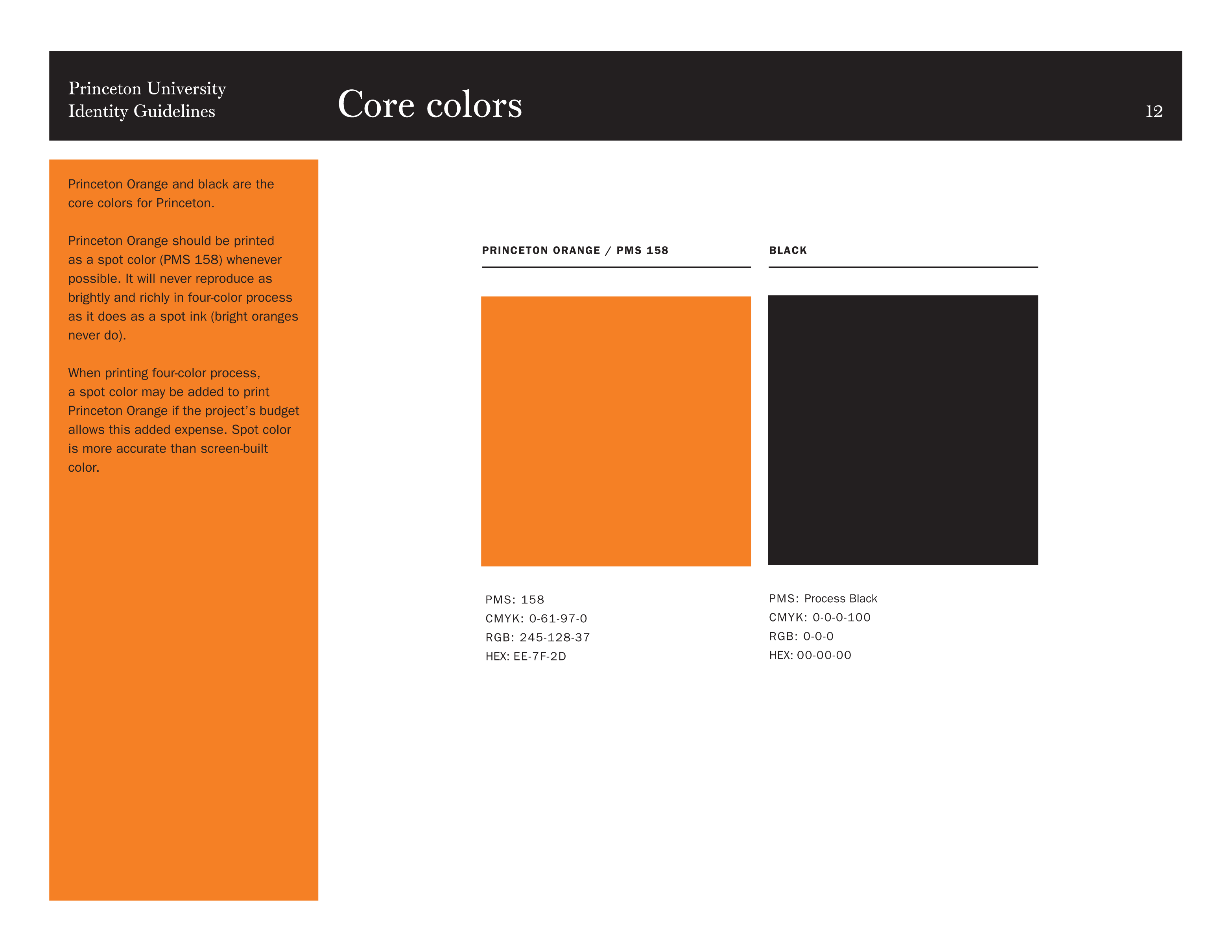
Official Brand Colors
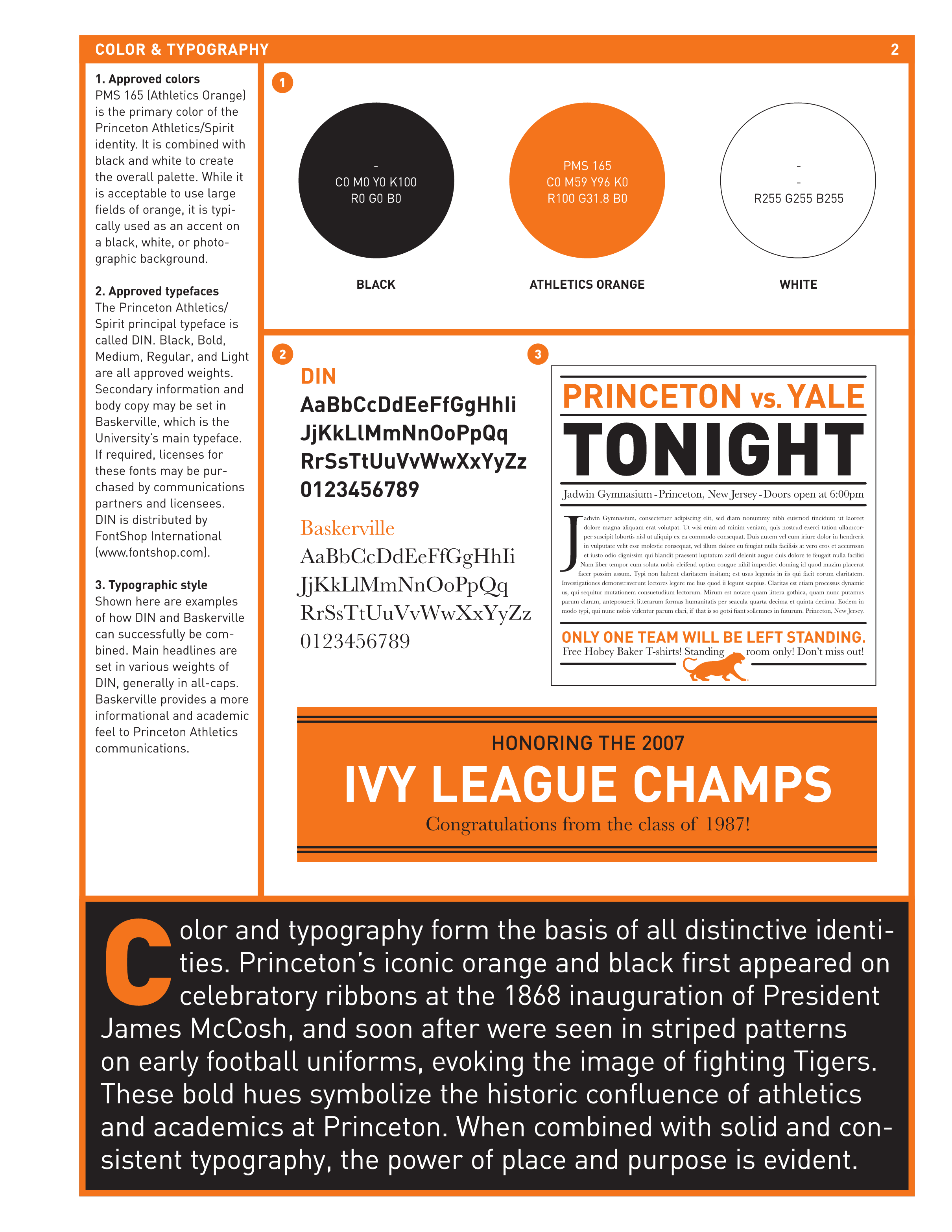
Princeton Athletics/Spirit Approved Colors
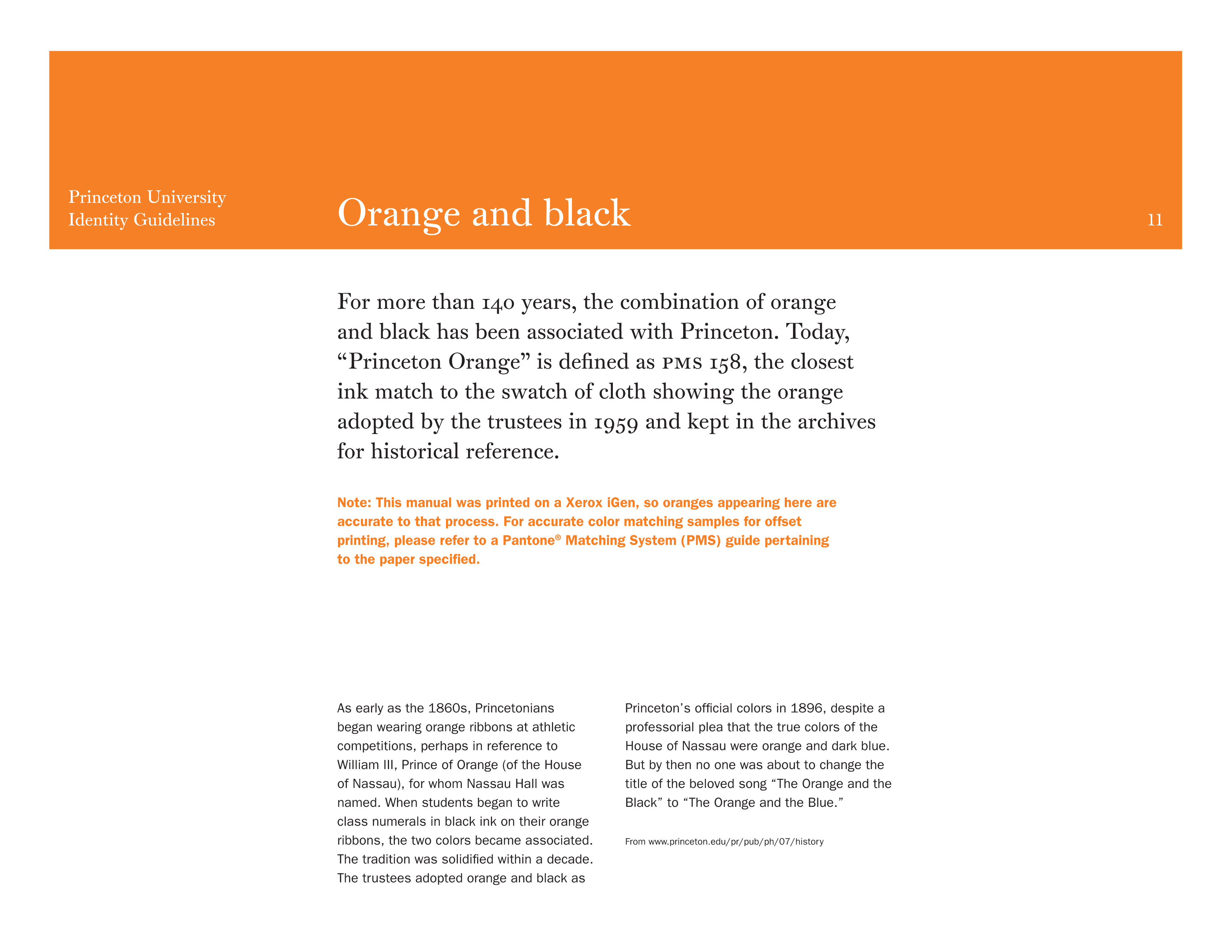
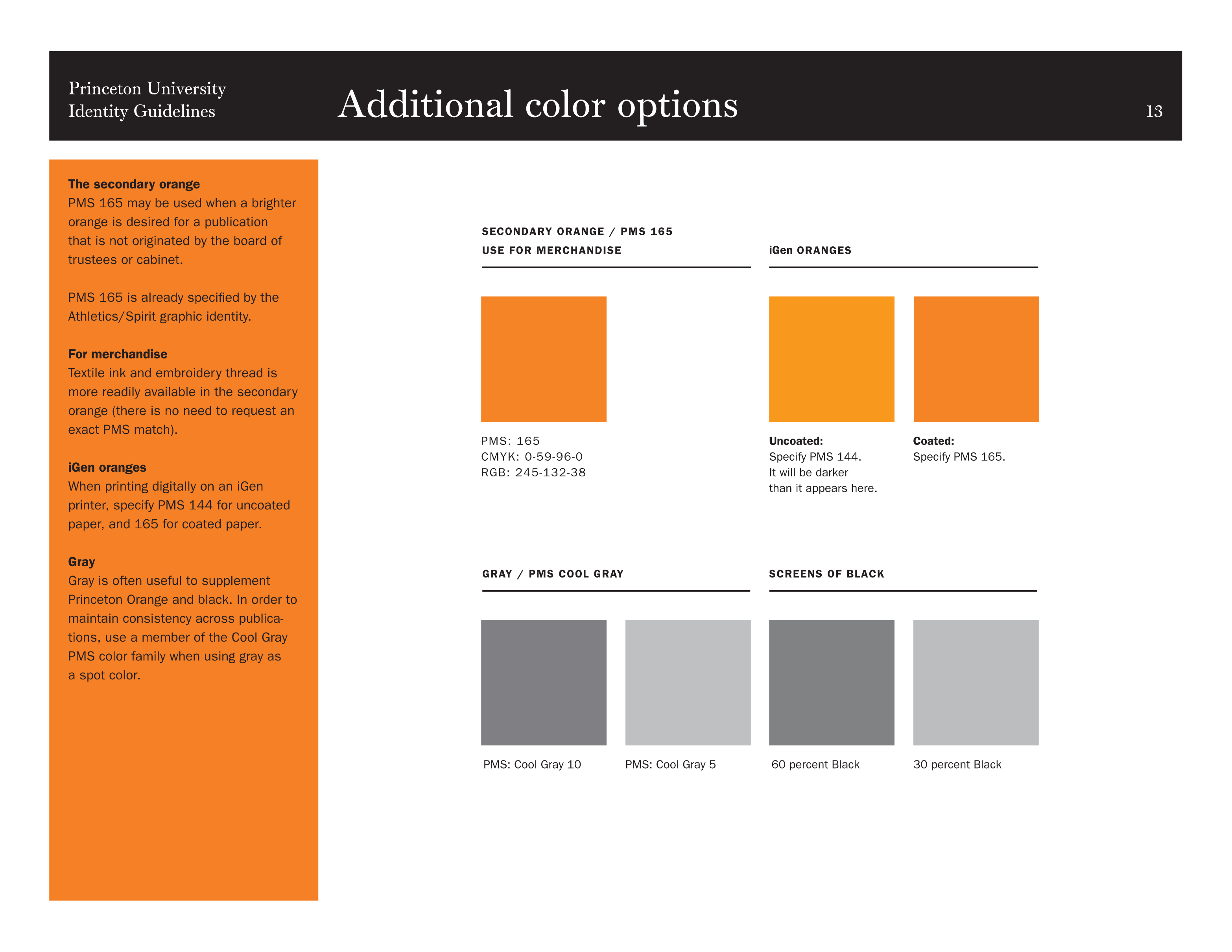
Princeton University Core Colors
Secondary Orange and Gray Usage
Logos & Marks

Primary LogoLast Updated : 6/23/2026
Primary LogoLast Updated : 6/23/2026
Primary LogoLast Updated : 6/23/2026
Primary LogoLast Updated : 6/23/2026
Primary LogoLast Updated : 6/23/2026

Primary LogoLast Updated : 6/23/2026

Primary LogoLast Updated : 6/23/2026

Primary LogoLast Updated : 6/23/2026

Primary LogoLast Updated : 6/23/2026

Primary LogoLast Updated : 6/23/2026

Primary LogoLast Updated : 6/23/2026

Primary LogoLast Updated : 6/23/2026

Primary LogoLast Updated : 6/23/2026

Primary LogoLast Updated : 6/23/2026

Primary LogoLast Updated : 6/23/2026

Primary LogoLast Updated : 6/23/2026

Primary LogoLast Updated : 6/23/2026

Primary LogoLast Updated : 6/23/2026
Primary LogoLast Updated : 6/23/2026

Primary LogoLast Updated : 6/23/2026

Primary LogoLast Updated : 6/23/2026
Primary LogoLast Updated : 6/23/2026
Primary LogoLast Updated : 6/23/2026
Primary LogoLast Updated : 6/23/2026

Primary LogoLast Updated : 6/23/2026
Primary LogoLast Updated : 6/23/2026

Primary LogoLast Updated : 6/23/2026

Primary LogoLast Updated : 6/23/2026

Primary LogoLast Updated : 6/23/2026

Primary LogoLast Updated : 6/23/2026

Primary LogoLast Updated : 6/23/2026

Primary LogoLast Updated : 6/23/2026

Primary LogoLast Updated : 6/23/2026

Primary LogoLast Updated : 6/23/2026

Primary LogoLast Updated : 6/23/2026

Primary LogoLast Updated : 6/23/2026

Primary LogoLast Updated : 6/23/2026

Primary LogoLast Updated : 6/23/2026

Primary LogoLast Updated : 6/23/2026

Primary LogoLast Updated : 6/23/2026

Primary LogoLast Updated : 6/23/2026

Primary LogoLast Updated : 6/23/2026

Primary LogoLast Updated : 6/23/2026

Primary LogoLast Updated : 6/23/2026

Primary LogoLast Updated : 6/23/2026

Primary LogoLast Updated : 6/23/2026

Primary LogoLast Updated : 6/23/2026

Primary LogoLast Updated : 6/23/2026

Primary LogoLast Updated : 6/23/2026

Primary LogoLast Updated : 6/23/2026

Primary LogoLast Updated : 6/23/2026

Primary LogoLast Updated : 6/23/2026

Primary LogoLast Updated : 6/23/2026

Primary LogoLast Updated : 6/23/2026

Primary LogoLast Updated : 6/23/2026

Primary LogoLast Updated : 6/23/2026

Primary LogoLast Updated : 6/23/2026

Primary LogoLast Updated : 6/23/2026

Primary LogoLast Updated : 6/23/2026

Primary LogoLast Updated : 6/23/2026

Primary LogoLast Updated : 6/23/2026

Primary LogoLast Updated : 6/23/2026

Primary LogoLast Updated : 6/23/2026

Primary LogoLast Updated : 6/23/2026

Primary LogoLast Updated : 6/23/2026

Primary LogoLast Updated : 6/23/2026

Primary LogoLast Updated : 6/23/2026

Primary LogoLast Updated : 6/23/2026

Primary LogoLast Updated : 6/23/2026

Primary LogoLast Updated : 6/23/2026

Primary LogoLast Updated : 6/23/2026

Primary LogoLast Updated : 6/23/2026

Primary LogoLast Updated : 6/23/2026
Secondary LogoLast Updated : 6/23/2026

Secondary LogoLast Updated : 6/23/2026

Secondary LogoLast Updated : 6/23/2026
Secondary LogoLast Updated : 6/23/2026

Secondary LogoLast Updated : 6/23/2026

Secondary LogoLast Updated : 6/23/2026

Secondary LogoLast Updated : 6/23/2026

Secondary LogoLast Updated : 6/23/2026
Secondary LogoLast Updated : 6/23/2026
Secondary LogoLast Updated : 6/23/2026
Secondary LogoLast Updated : 6/23/2026
Secondary LogoLast Updated : 6/23/2026
Secondary LogoLast Updated : 6/23/2026

Secondary LogoLast Updated : 6/23/2026
Secondary LogoLast Updated : 6/23/2026
Secondary LogoLast Updated : 6/23/2026
Secondary LogoLast Updated : 6/23/2026

Secondary LogoLast Updated : 6/23/2026
Secondary LogoLast Updated : 6/23/2026
Secondary LogoLast Updated : 6/23/2026

Secondary LogoLast Updated : 6/23/2026
Secondary LogoLast Updated : 6/23/2026
Secondary LogoLast Updated : 6/23/2026

Secondary LogoLast Updated : 6/23/2026

Secondary LogoLast Updated : 6/23/2026
Secondary LogoLast Updated : 6/23/2026

WordmarkLast Updated : 6/23/2026
WordmarkLast Updated : 6/23/2026

WordmarkLast Updated : 6/23/2026

WordmarkLast Updated : 6/23/2026
WordmarkLast Updated : 6/23/2026

WordmarkLast Updated : 6/23/2026
WordmarkLast Updated : 6/23/2026

WordmarkLast Updated : 6/23/2026

WordmarkLast Updated : 6/23/2026

WordmarkLast Updated : 6/23/2026

WordmarkLast Updated : 6/23/2026

WordmarkLast Updated : 6/23/2026

WordmarkLast Updated : 6/23/2026

WordmarkLast Updated : 6/23/2026

WordmarkLast Updated : 6/23/2026

WordmarkLast Updated : 6/23/2026

WordmarkLast Updated : 6/23/2026

WordmarkLast Updated : 6/23/2026

WordmarkLast Updated : 6/23/2026

WordmarkLast Updated : 6/23/2026

WordmarkLast Updated : 6/23/2026

WordmarkLast Updated : 6/23/2026

WordmarkLast Updated : 6/23/2026

WordmarkLast Updated : 6/23/2026

WordmarkLast Updated : 6/23/2026

WordmarkLast Updated : 6/23/2026

WordmarkLast Updated : 6/23/2026

WordmarkLast Updated : 6/23/2026

WordmarkLast Updated : 6/23/2026

LettermarkLast Updated : 6/23/2026

LettermarkLast Updated : 6/23/2026

LettermarkLast Updated : 6/23/2026

LettermarkLast Updated : 6/23/2026

LettermarkLast Updated : 6/23/2026

LettermarkLast Updated : 6/23/2026

LettermarkLast Updated : 6/23/2026

LettermarkLast Updated : 6/23/2026

LettermarkLast Updated : 6/23/2026

LettermarkLast Updated : 6/23/2026

LettermarkLast Updated : 6/23/2026

LettermarkLast Updated : 6/23/2026

LettermarkLast Updated : 6/23/2026

LettermarkLast Updated : 6/23/2026

LettermarkLast Updated : 6/23/2026

LettermarkLast Updated : 6/23/2026

Sport LogoLast Updated : 6/23/2026
Sport LogoLast Updated : 6/23/2026

Sport LogoLast Updated : 6/23/2026

Sport LogoLast Updated : 6/23/2026
Sport LogoLast Updated : 6/23/2026

Sport LogoLast Updated : 6/23/2026

Sport LogoLast Updated : 6/23/2026

Sport LogoLast Updated : 6/23/2026
Sport LogoLast Updated : 6/23/2026

Sport LogoLast Updated : 6/23/2026

Sport LogoLast Updated : 6/23/2026

Sport LogoLast Updated : 6/23/2026
Sport LogoLast Updated : 6/23/2026

Sport LogoLast Updated : 6/23/2026
Sport LogoLast Updated : 6/23/2026

Sport LogoLast Updated : 6/23/2026

Sport LogoLast Updated : 6/23/2026
Sport LogoLast Updated : 6/23/2026

Sport LogoLast Updated : 6/23/2026

Sport LogoLast Updated : 6/23/2026
Sport LogoLast Updated : 6/23/2026

Sport LogoLast Updated : 6/23/2026
Sport LogoLast Updated : 6/23/2026

Sport LogoLast Updated : 6/23/2026

Sport LogoLast Updated : 6/23/2026
Production ArtworkLast Updated : 6/23/2026
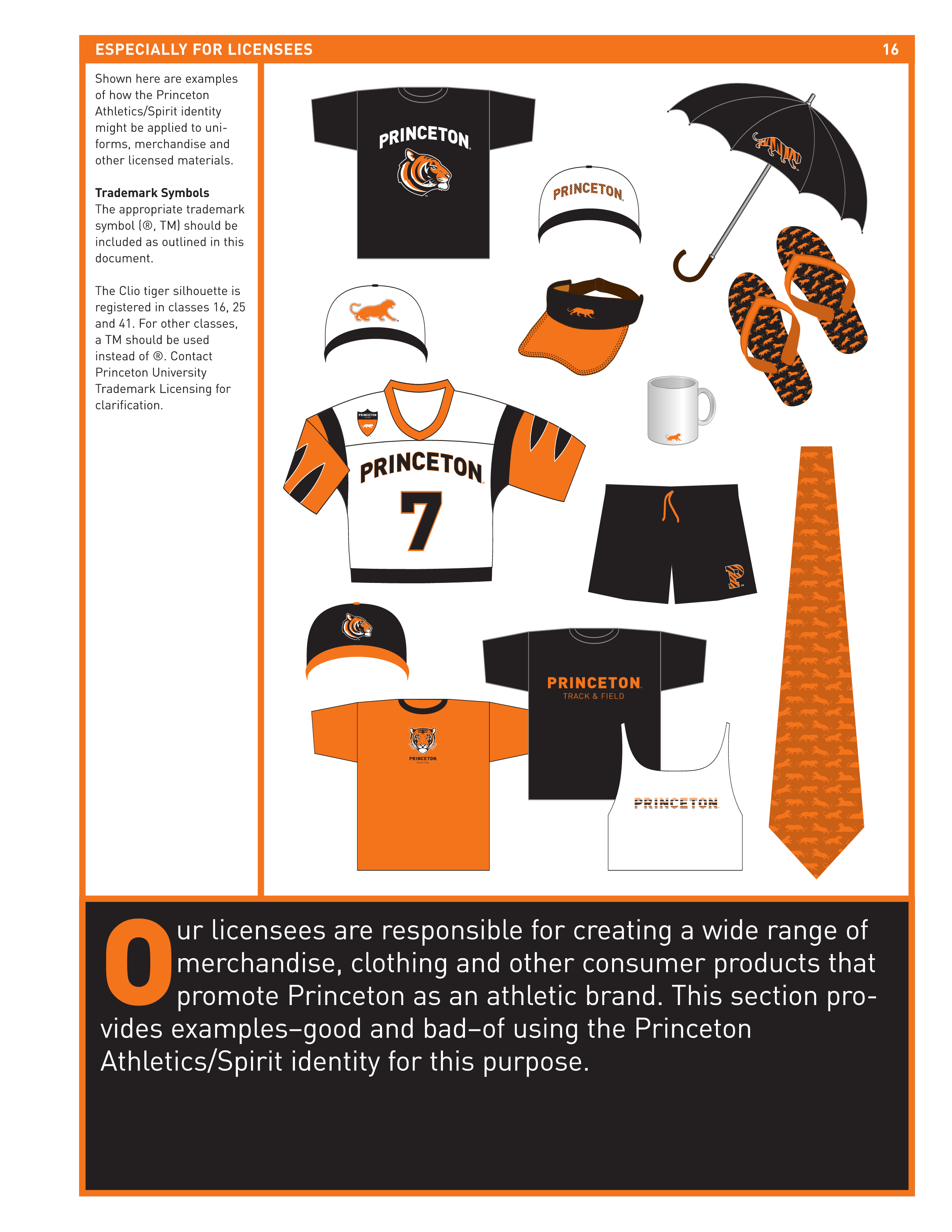
Production ArtworkLast Updated : 6/23/2026
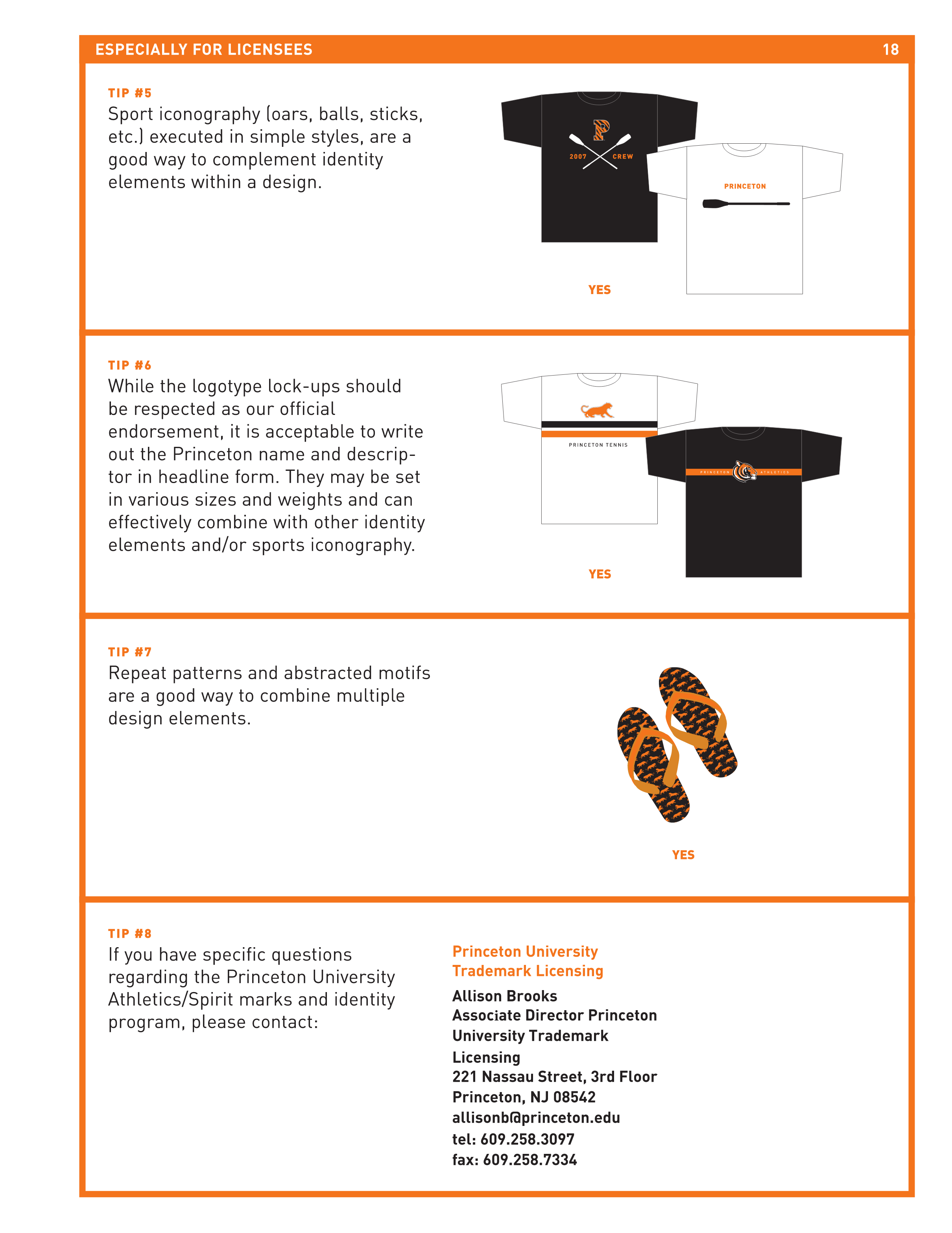
Production ArtworkLast Updated : 6/23/2026
Production ArtworkLast Updated : 6/23/2026
Production ArtworkLast Updated : 6/23/2026
Production ArtworkLast Updated : 6/23/2026
Production ArtworkLast Updated : 6/23/2026
Production ArtworkLast Updated : 6/23/2026
Production ArtworkLast Updated : 6/23/2026
Production ArtworkLast Updated : 6/23/2026
Production ArtworkLast Updated : 6/23/2026
Production ArtworkLast Updated : 6/23/2026
Production ArtworkLast Updated : 6/23/2026
Production ArtworkLast Updated : 6/23/2026
Production ArtworkLast Updated : 6/23/2026
Production ArtworkLast Updated : 6/23/2026
Production ArtworkLast Updated : 6/23/2026
Approved Verbiage
No approved verbiage specified.
Rules & Guidelines
AI Agent DevelopmentCollegiate Licensing ConsultantDevOps & Software DevelopmentOdoo ERP ServicesClaris FileMaker Development




© 2026 Alpha Dezine. All Rights Reserved.
Last Updated: October 20, 2026
